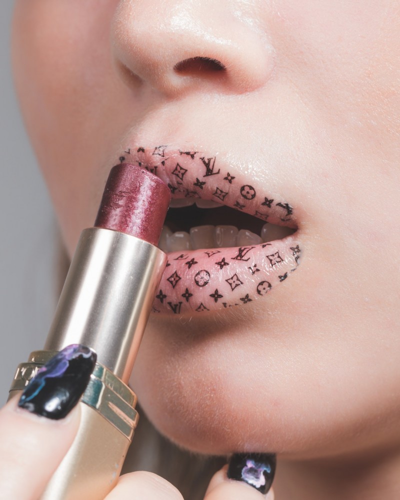
Did you know that when meeting a person for the first time you have less than 30 seconds to impress them?
If that’s true when meeting a person face to face, how much more do first impressions count when choosing cosmetics?
With so much competition out there, it’s essential to capture the audience as soon as they lay eyes on your product. So, how can you make a good first impression?
The secret lies in designing an amazing cosmetics logo. It’s the first thing the consumer will see, and whether you like it or not, they’ll be judging.
What are the secrets to designing a cosmetic logo? Read on to find out.
It All Begins With Branding
Having the right makeup cosmetic logo design is key to building your brand. And building your brand is essential to success, how so?
Building a brand is essentially creating a strong identity in the field you’re aiming for. Your companies theme of color, font, and design will run throughout your branding making it easily recognizable.
When clients repeatedly see your branding on business cards, in your salon’s decor, through social media, on images, uniforms, packaging, and vehicle stickers your brand will stay at the top of peoples minds.
For example, we can easily recognize Kylie Jenners brand from a mile off – the letters KYLIE in a simple bold font with melting lips.
Make Your Cosmetic Logo Shine
Like Kylie, you need to create a distinct personality that your customers will recognize immediately.
Your logo will be the face of your brand. A clear logo that gets the message across, yet provokes interest, will help you to attract customers and build your identity.
Your unique makeup artistry logo can express your vibe and values through symbolism and a variety of elements. The aim is to help your brand stand out from the crowd.
Pick Your Vibe
Before you pick a theme and logo, you need to establish the overall vibe of your beauty business.
Think about your business and decide what kind of atmosphere you want to create. For instance, is it meant to be comfortable and practical, or is it supposed to be ultra glam with a luxurious feel?
Here are a few ideas:
- Ultra Feminine – Bring out the girly girl within with bright pinks and glam shades of red. Stiletto heels and other fashion icons can be incorporated into this glam theme.
- Comfort and Pamper Sesh – Soft hues of greens and blues to promote relaxation.
- Exotic International – Choose an exotic country as your themes, such as Japan or India. Take elements from the culture and fashion of the country to bring out in your designs.
- Minimalist – Bright whites, geometric prints, and botanical designs all look great in a minimalist look.
- Vintage – Classy antique designs using glam movie stars from the past such as Marilyn Monroe.
Whatever vibe you choose, reflect your theme throughout. From the art that you hang on the walls of your salon, to the style of your website – keep the theme running through.
How to Build the Ultimate Makeup Artistry Logo
There are no set rules when it comes to creating a cosmetic logo design, but there are several elements to keep in mind. Mixing and matching the right fonts, colors and styles can help you to connect with your target audience.
Let’s take a look at the essentials one by one.
Versatile Icons
Choose icons for your logo that can give your consumers a visual representation of your company. However, you may choose not to use an icon at all. Some successful cosmetic companies just use their names, such as Estee Lauder, Clinique, and Bobbi Brown.
Your logo should be designed so that it is versatile. It should be able to work vertically and horizontally. You should also be able to resize it without it becoming unrecognizable.
Your logo should also be able to work both with the icon and text or with the icon only. This means it’s key that the icon is unique and recognizable. For instance, you don’t need the words McDonald’s to recognize the golden-arched “M” sign.
Aesthetically Pleasing Fonts
Makeup logos generally have fonts that are not too fancy and clean cut. These simple typefaces create an elegant feeling without overdoing it.
Some common fonts that are widely used in makeup artistry logos include Optima, Avant Garde Gothic, Helvetica Neue, Univers Narrow, Garamond and Brandon Texts. If you’re not a techie, type the names into Google to see what they look like.
Understated Colors
Although it may seem that bright colors will make your logo stand out, it can actually give a tacky vibe. Most cosmetic brands choose understated tones or just stick to monochrome. However, it all depends on your brands’ personality.
When choosing your color scheme you should keep in mind your companies values. If you want to project a sense of luxury and sophistication, cool colors such as light blues, purples, blacks, and white will work. Whereas if you want to give off a fun-loving vibe, loud bold colors may be the way to go.
You also need to keep in mind the age of your audience. Younger age groups may prefer a fun, carefree look, whereas older age groups may prefer classy, understand tones.
Take Action — Get Designing
Now you can see the importance of cosmetic logo design, it’s time to take action.
We recommend Image 360 for all your graphic designing needs. Their professional team will collaborate closely with you to attain your dream logo, even if you’re on a tight budget. Click here for more information.
First Impressions Are Everything
As you can see, to stand out in the beauty field you need a unique cosmetic logo. First impressions really are everything in this industry – you’ve got to get it right!
Each beauty guru has something special that makes them unique and different from the rest. Take advantage of it and show the world what you’re made of.
Now you’ve got your head around branding and logos, how can you create a happy workplace for both you and your employees? Read this article to find out.


